Charts, Tables, and Graphs
Color Assignments
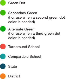
We have assigned colors from our primary and secondary color pallets for our most commonly used data categories so that someone in the home office can easily identify and understand data points in the same way as someone at a Green Dot middle school.
Use the assigned colors at all times when referencing these data categories in any visual way (graphs, charts etc).
Colors
Use the Primary Green color for a Green Dot data point in a chart or graph. Introduce the secondary and alternate greens if there are multiple Green Dot data points (i.e. Green Dot school average vs. Green Dot organizational average).
Communicating Data
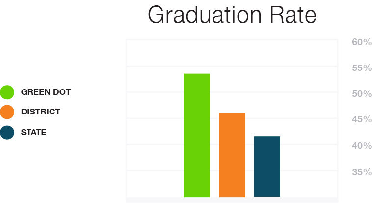
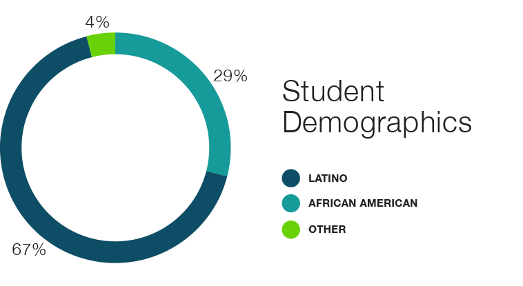
Graphs, tables and charts are excellent ways to convey data and analyze data. They also contribute to uniform Green Dot brand excellence when created in accordance with the below style guidelines.
Vertical Bar Graph Example
Pie Chart Example
Line Graph Example
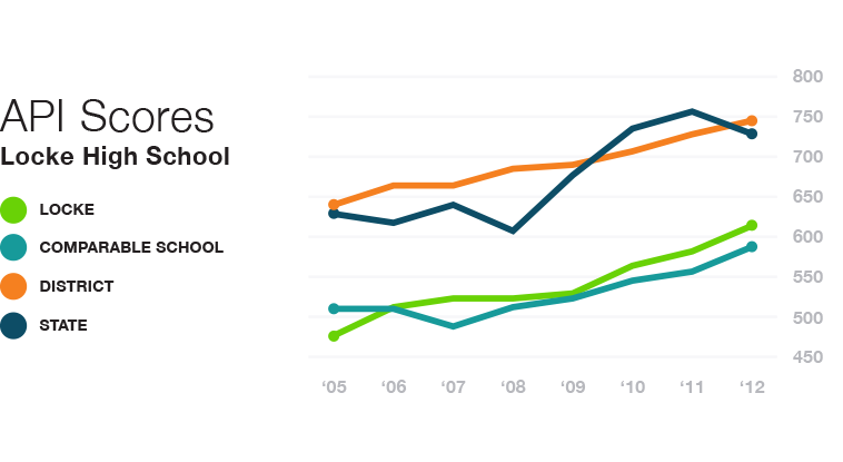
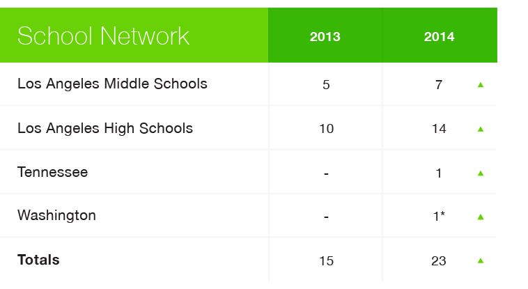
Table Example
Green Dot Public Schools National
1149 S. Hill St.
Los Angeles, CA 90015
(323) 565-1600
